News:

Go Back!

 Mother1
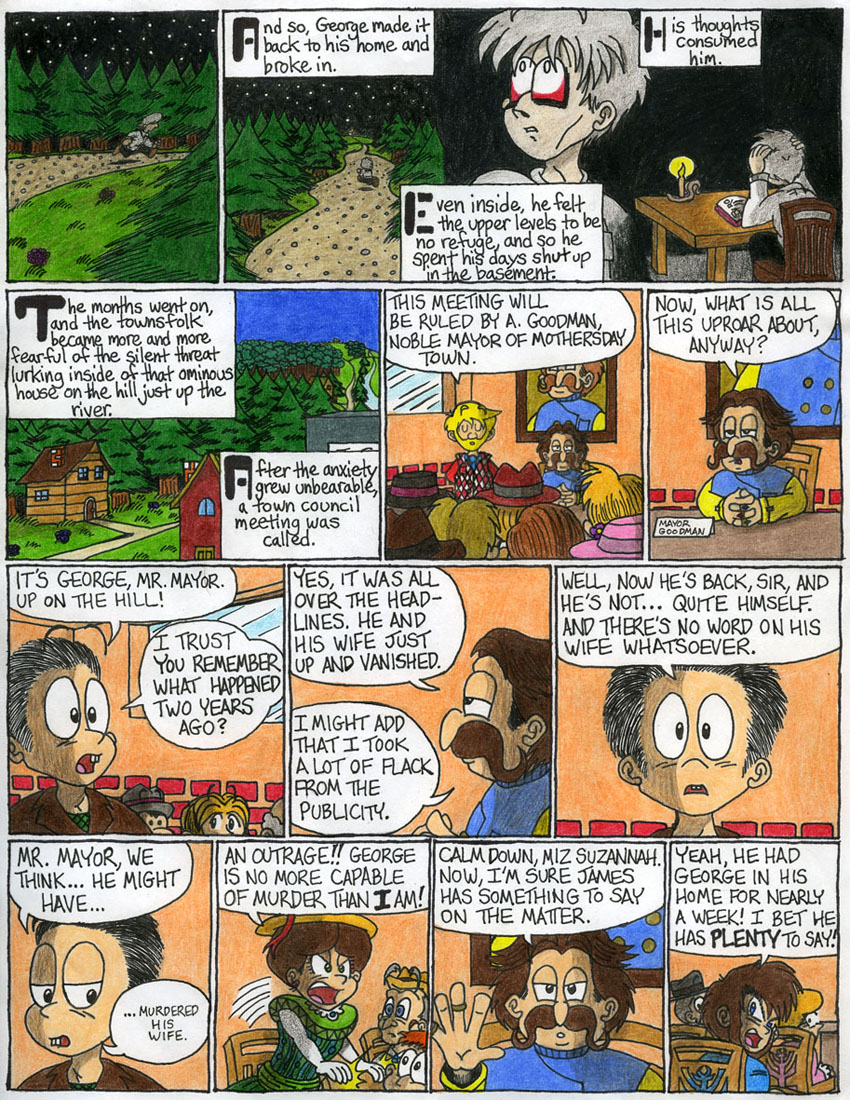
Prologue - Page 17: Town Anxiety - by kenisu3000

Prologue - Page 17: Town Anxiety


kenisu - #17
Ever since I finished EB Zero back in 2000, whenever I imagined George poring over his notes, I pictured him sitting at a scanty table in a dark, dank basement scene. It feels soooo nice to be able to put these long-time mental images on paper.
Also, I was originally going to color the mayor's over-vest red, but then when I looked at the next-to-last panel (where he's silencing Suzannah), I realized that I made him look awfully Russian, so instead, I colored his vest blue. And speaking of Suzannah, I think I may have made yet another historical oopsie here: back in those days, women had very few privileges, so what are several women doing at a TOWN COUNCIL MEETING? Of course, from the very beginning, I knew I wanted the characters to have some sort of audience with the mayor to discuss the situation with George, but originally it was supposed to be a small enclosed meeting with her, James, a FEW involved townsfolk, and the mayor; but eventually it evolved into a full-out town council meeting.
At any rate, I needed Suzannah present to be able to move the story forward. So I fudged a little.


Other Submissions by kenisu3000

Author Sort Ascending Sort Descending Title Sort Ascending Sort Descending Description Sort Ascending Sort Descending Date Sort Ascending Sort Descending Rank Sort Ascending Sort Descending
kenisu3000 Frankystein Mark I
Not Mark II... Mark I!
Oddly enough, the post I uploaded this to in the forum got a downvote. Apparently, someone has a childhood trauma involving Jack-in-the-Boxes (well, I know *I* do, but...).
4/17/09 0.00
kenisu3000 Chapter 1 - Page 58: Of Oreos and Hocus-Pocus
kenisu - #58
I've always felt the livingroom was awfully... stark. I designed it similar to what's seen in the game, knowing full well how bland and... I dunno, threadbare(?) it looked, but I wanted to keep it that way, just for a laughable throwback to the simple 8-bit design of the game. But dang, after drawing and coloring all these pages, it seems to me that I should have at least succumbed to wallpaper, windows and a light fixture! What kind of psycho house -doesn't- have windows around its front door? And without those windows or an immediate light source aside from the kitchen window, how could it be so bright indoors? That's the price of adhering 100% to the game's design for the house's exterior first, THEN putting together the interior. You look at the inner layout and realize it doesn't conform to the outer structure at all. In the game, the front door, as seen from the the livingroom, is brown and square at the top, with no built-in window, but outside, it's gray with a rounded top and window, AND the doorknob's on the wrong side! So I changed it to fit the outside appearance. At least that's one claim to consistency I can make.

I need a life.
5/3/09 0.00
kenisu3000 Chapter 1 - Page 59: Dumb Animal He Ain't
kenisu - #59
I apologize for making Mick a smoker. Since he stands on two legs, I kept seeing this image in my head of him leaning casually against his doghouse, and from there it's easy to see how a cigarette found its way into his mouth.
Of course, this begs the question: Where, when and how did he pick up this habit? Peer pressure from the local crows?
6/15/09 0.00
kenisu3000 Chapter 1 - Page 60: Keys 'n' Things
kenisu - #60
You may remember that when Minnie and Mimmie were first introduced, they spoke in unison and had the same personality. There's the old cartoon cliche of twins being "of one mind" (and in some extremely annoying cases, displaying this aspect by finishing each others' sentences). However, I soon decided to break this unspoken rule and make them virtually polar opposites. Now, Minnie, being older (albeit by only a few minutes), speaks on Ninten's grammatical level and shows much more maturity than her younger counterpart, Mimmie, who still uses "baby talk" and often acts on the same maturity level of her speech.
...I dunno, maybe it's funnier this way...?
6/15/09 0.00
kenisu3000 Chapter 1 - Page 61: Cellar Scrutiny
kenisu - #61
When choosing between blacking in the background with ink or colored pencil, I opted for the latter. It was more work, but I like the effect I accidentally created when I blended in the Dark Brown: it gives it a "dusty air" look. Just looking at these panels makes me want to cough.
6/15/09 0.00

Junk:

Latest Updates:

FAN VIDEOS >:. ...> EarthBound Saga Ch. 5 - Released at Last!
EBFGP >:. ...> An Apology from Starmen.Net and GPP 16 - Cave of the Past w/ vid!
EBFGP >:. ...> EBFGPS 2024 - GPP 15 - Magicant w/ BubblyOasis!
EBFGP >:. ...> EBFGPS 2024 - GPP 14 - Lost Underworld w/ Cyan683!
EBFGP >:. ...> EBFGPS 2024 - GPP 13 - Stonehenge w/ Nightshade!

Activities:

EarthBound Fanfest 2010
MOTHER 2 Novel Translation Project!
EarthBound Central -- Good News for the Modern Fan
Fangamer Banner
MOTHER 3 Fan Translation
Starmen.Net EarthBound Walkthrough
Starmen.Net Mother 3 Walkthrough
Donate to Starmen.Net!

Site Info:

Wanna know more about the staffers? The Site History? The Forum Badge Guide? All the info is here!

Polls:

How do you use Starmen.net?
Last Week's Poll
Which of the Super Smash Bros. Newcomers is your favourite?
Image of Last Week's Poll

Radio PSI:

Bringing the EarthBound community together through the magic of music.
Privacy Policy